Those Difficult Client Communications: An Exercise in Health Literacy
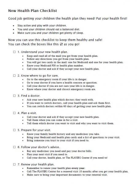
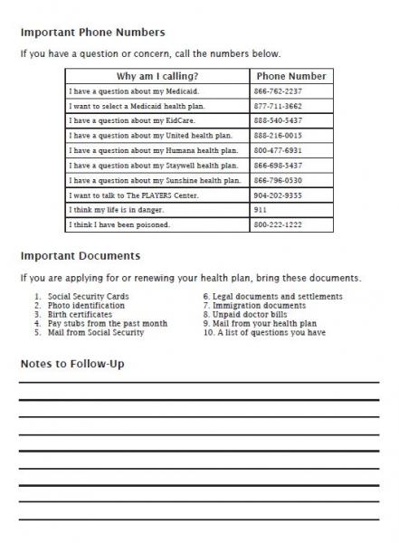
 Around halfway into my service term with National Health Corps Florida, AmeriCorps, my host site tasked me with making a “Low-Level Reader” document to make it easier for our clients seeking income-based health coverage options to navigate their coverage after the initial enrollment. I took on the assignment with pride, since much of the communications training offered through my chemical engineering degree pushed distilling (pardon the pun) complex chemical processes down to the most essential elements.
I assumed this would be a task of simplifying the Medicaid and CHIP qualification criteria. Explaining the guidelines and the “mathy” part of the application to families is usually the most difficult part of our appointments, but when I floated this first draft by my host site supervisor, she reiterated that the goal of the document shouldn’t be to define the programs. The document should function as a guide for families who have trouble reading health materials. While my engineering education emphasized numeracy, the document should address literacy.
While researching strategies to address low literacy in our clients, I came across a 2016 publication from Kaiser Permanente geared towards addressing low literacy in their clients. The publication reminded me of my early English classes with tips and tricks for improving comprehension that I had not considered. Grammar suggestions included:
1. Create bulleted lists (3 to 7 items) to break up topics.
2. Use active voice over passive voice.
3. Use first or second person pronouns (“I,” “we,” “you”).
4. Keep it short. Words should have 3 syllables or fewer, sentences should have 10 words or fewer, and paragraphs should have 5 sentences or fewer.
5. Limit abbreviations and jargon.
I thought there were plenty of suggestions to start the document, and interestingly enough, most versions of Microsoft Word can check this with a small addition to the “Spell Check” function. But the publication offered more suggestions about the way the document should be laid out, which, unfortunately, there is no “Spell Check” for, such as:
1. For headings, use a font size at least two points larger than body text.
2. For body text, use fonts with serifs. For heading text, use fonts without serifs or “sans serif.”
3. To emphasize text, use boldface, larger font, or ●bullets●. Limit the use of italics, underlining, “excessive quotations,” or ALL CAPS.
4. Use dark letters on a light background.
5. Include adequate white space.

These layout tips aren’t things engineering students are taught, and they don’t usually come up in early English classes either. The publication also suggested evaluating the Flesch-Kincaid Grade Level of the document. “Spell Check” can evaluate this by measuring the number of words per sentence and syllables per word. For example, the From Coverage to Care Roadmap distributed by the US Department of Health and Human Services (page 4 and 5) reads at about a sixth grade reading level. After five drafts of my “Low-Level Reader” document, I was able to get the document to a third grade reading level, and it has already helped my clients follow through on navigating their coverage.

This blog post was written by NHC FL AmeriCorps Member, Will
Will serves at The PLAYERS Center for Child Health at Wolfson Children’s Hospital as a Care Coordinator.